We all know that social sharing is a great way to attract more visitors to our posts which in turn has the added SEO benefit. If you want more shares, you need to give your readers and easy way to do so.
Using a floating social share bar that scrolls with the post will do just that.
Because of the limited space on mobile, we are going to create two separate sets of share buttons; one for desktop and tablet first, and then one for mobile devices.
Using Elementor Pro
In this article I am going to explain how to create a social share bar in Elementor Pro without any additional plugins. This will keep your site lighter and help it load faster.
Read our Elementor Pro review to learn why we believe it’s the best page builder available.
Using E-pro also has the added benefit of being able to choose the perfect placement and behavior (i.e. motion effects) of your buttons.
Creating a Share Bar in 5 Easy Steps
Step 1: Create a Single Post Template
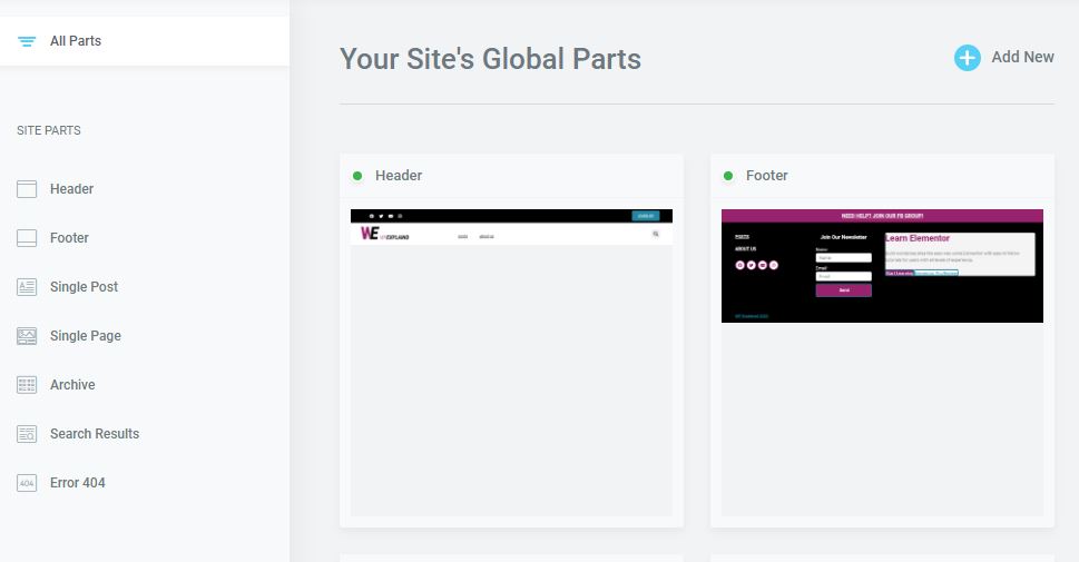
For this step we will be using the theme builder.
Your theme is built on PHP templates and Elementor theme builder allows you to edit these via their drag and drop interface.
It’s really quite amazing for designing a custom website!
3 Easy steps for creating a single post template
Open the theme builder by hovering over “templates” in your wordpress dashboard and click on “theme builder”. Elementor 3.0 has a newly redesigned visual experience (see below).
Full tutorial for designing a single post template.
Next, click the plus icon and select single post (this will bring up the template library where you can select a premade template or create your own)
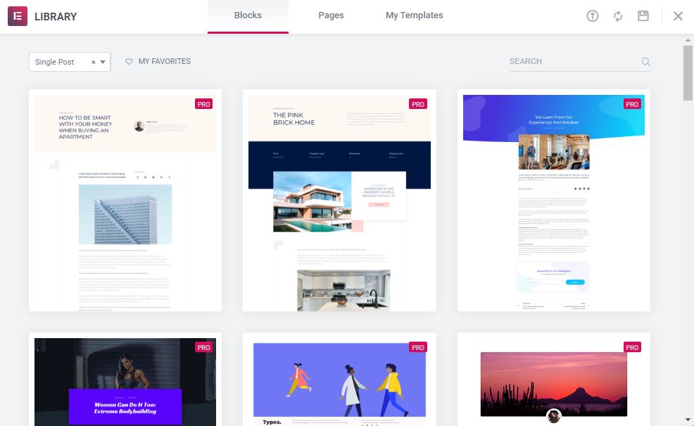
Now, either select one of the pre-made designs or create your own by clicking the “X” in the top right corner
Step 2- Design the Layout
Start designing the layout by adding a new section and creating two columns; one for your post content and one for your side bar. Adjust the column width so that you have a wide column and a narrow column.
- Create a new section
- Add two columns
- Adjust the column width
I like to use a 70% width for my post content and 30% for my sidebar.
Add your buttons to your sidebar. This will be used on both desktop and tablet devices. Click on advanced and scroll down to “responsive” to hide these buttons on mobile devices.
The reason for this is because of the limited space you have on smaller devices. Later on in the article you will learn how to add share buttons for mobile.
Step 3- Add Elements (widgets)
Add any elements you may want to include in your single post template in one column (i.e. post title, featured image, meta data, post content, related posts, comments, etc… )
Add the “share button” widget to the second column. By default, this widget displays 3 social networks; Facebook, Twitter, and LinkedIn. Feel free to add any others that you may like.
Now that we have all of the necessary sections, columns, and elements in place, it is time to adjust the settings and add some additional options.
Step 4- Adjust Settings
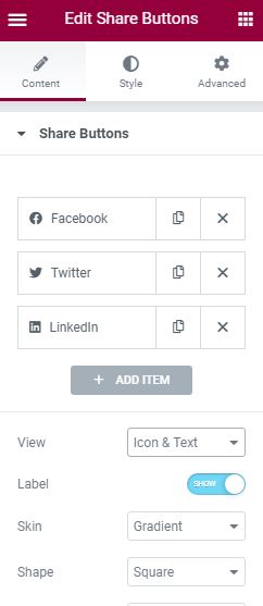
If you are familiar with elementor, then you can probably skip this step as you already know how. In the settings panel you can change the “view”, “skin”, “shape”, “columns”, “alignment”, and “target”.
The default view of the “share button” widget is “icon and text” but you can change that to just “icon” (this is what i prefer) or just “text” if you wish.
The rest of the settings are pretty self explanatory. Next, you can style your buttons (i.e. change the color, spacing, etc.) in order to match your site.
Step 5- Make it Sticky
If you want your share bar to Scroll down as visitors read your post you are going to need to make it sticky. Elementor makes this extremely easy.
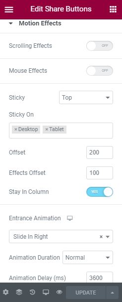
Click on the “advanced” tab in your elementor settings panel and click on “motion effects” to expand your options.
From the drop down you will be presented with two options, “top” and “bottom”.
Select top.
After doing that you will be presented with more options. Below is a list of those options explained.
Motion Effects Options Explained
“Sticky on” allows you to control which devices your share buttons will be sticky on; hence the name.
“Offset” (measured in pixels) controls where the share bar is displayed relative to the column. By default, it will display at the top of the column. This is useful if you want to avoid overlapping other floating elements.
For example: If you are using a sticky header like I am in this blog, you will need to set an offset to avoid having them overlap.
“Effects offset” (also measured in pixels) controls when the scrolling effect begin. By default it is set to “0” and will start scrolling with the page immediately.
“Stay in column” does exactly what it says; it will keep your share bar in column. Turning this on will prevent it from floating into your footer.
I suggest you turn this on.
“Entrance animation” can be used to grab the attention of your visitors. By default, this is turned off but you can select the desired effect from the drop down menu as well as adjust the speed and delay in milliseconds (1/1000 of a second).
Creating Share Buttons for Mobile
Mobile sharing should be handled a little differently because of the smaller viewport. We don’t want to cover up any important content and impede your viewers from reading in any way.
You would be surprised how many blogs do this unknowingly when using a share plugin.
By default Elementor will will inherit your desktop settings on tablet and mobile. Make sure you adjust your padding and margins for each device.
Mobile Placement
We will be using the same single post template we created earlier, just adjusting the placement. Thankfully most of the work was done in preparation for larger screens.
Scroll to the bottom of the column where your main content is. Just before your comments or related posts (if you have them).
- Add a new share button widget. Format it.
- Go to the advanced tab > turn sticky on > select “bottom” from the drop down menu
- Still in the advanced tab > scroll down to responsive > turn desktop and tablet to “off”
- Click save.
Mobile Placement
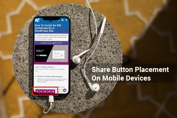
Now your mobile share bar will sit at the bottom of the viewport and scroll with the post. As you scroll to the bottom, they will move inline just before your related posts or comment section.
I have found this way to be better than using a popup.
Conclusion
In this post you learned how to create a floating share bar optimized for all devices using Elementor; and all without adding any additional plugins.
Because of the limited space on mobile, we added two separate sets of share buttons; implemented to behave differently depending on the device.


